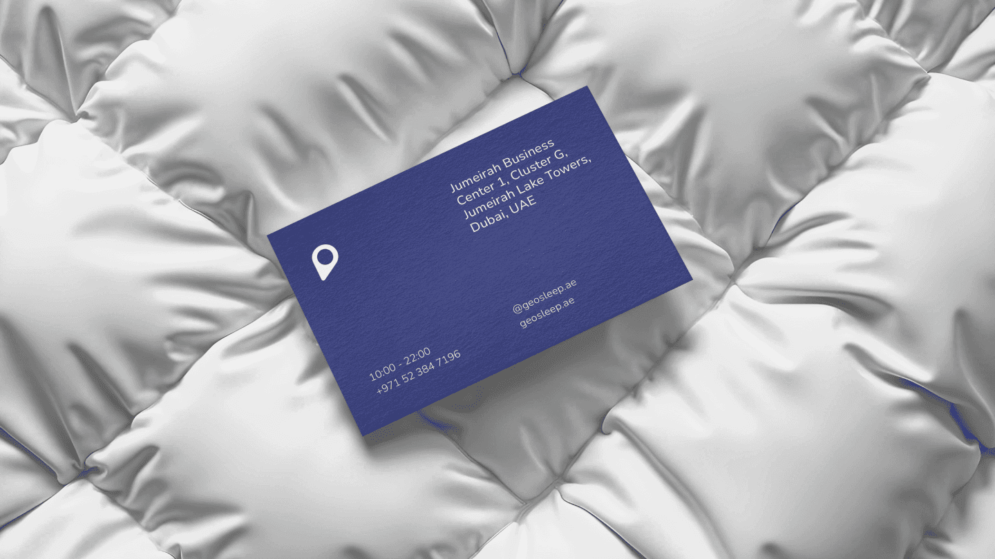
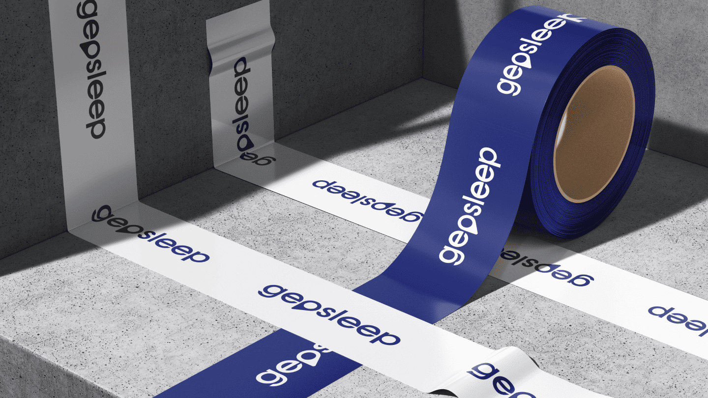
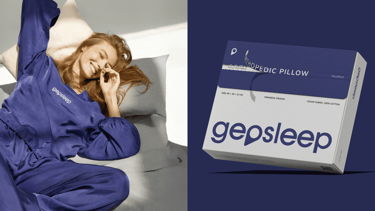
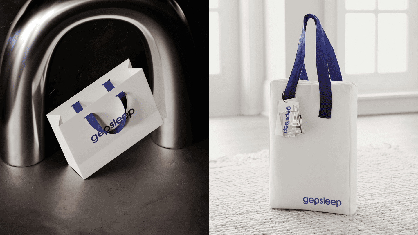
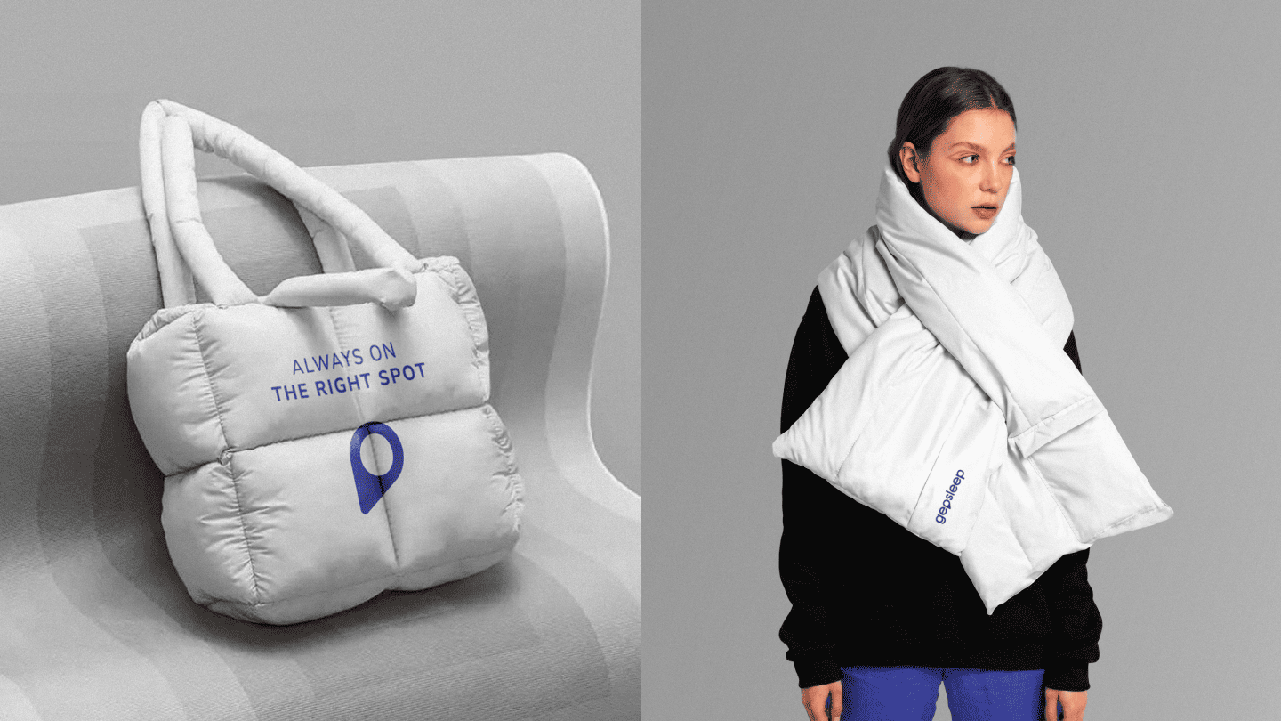
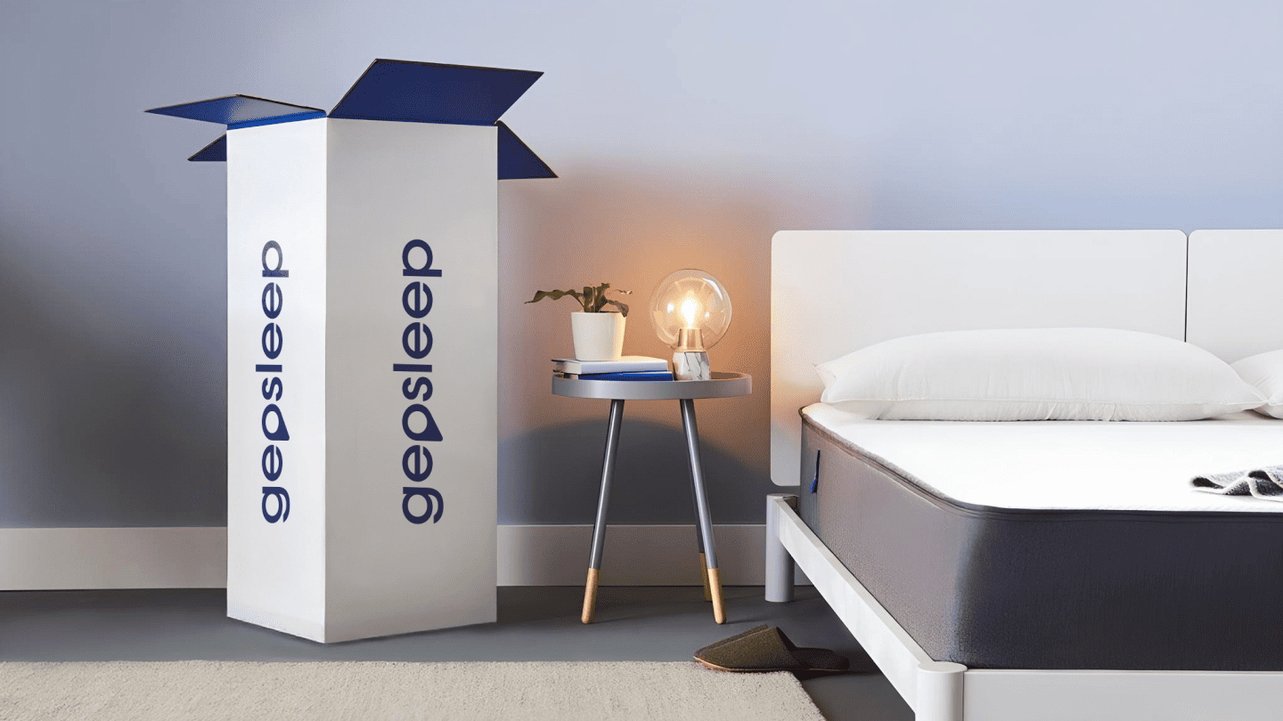
Development of a logo and brand book conveying the brand's idea of "comfort found" for sleep products.
The logo reflects the brand’s core philosophy: the search for the perfect place to sleep. A geo-tag integrated into the letter "o" symbolizes comfort that has already been found. The clean and lightweight design conveys a sense of tranquility and airiness, while the use of deep midnight blue combined with white (as shown in image_ef0c31.png) creates a direct association with a serene night and absolute coziness.
This personal data processing agreement is developed in accordance with the legislation of the Republic of Kazakhstan.
All persons who have submitted information constituting personal data on this website, as well as those who have provided other information by the indicated actions, confirm their consent to the processing of personal data and its transfer to the personal data processing operator.
Personal data of the Citizen means the following information: general information (name, phone number and email address); website visitors submit their personal data in order to receive detailed information about the services.
By accepting this Agreement, the Citizen expresses their interest and full consent that the processing of their personal data may include the following actions: collection, systematization, accumulation, storage, clarification (update, change), use, destruction.
The Citizen warrants that: the information provided is complete, accurate and reliable; providing this information does not violate the current legislation of the Republic of Kazakhstan or the legal rights and interests of third parties; all the information provided was filled in by the Citizen in respect of themselves personally.