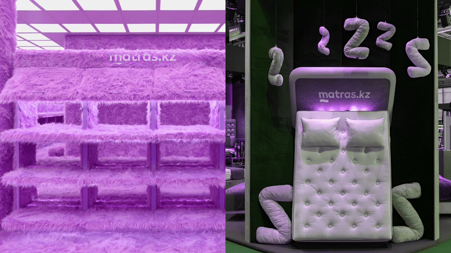
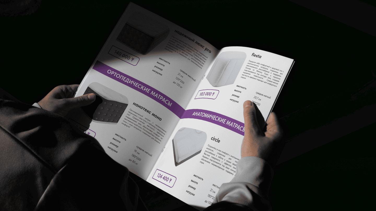
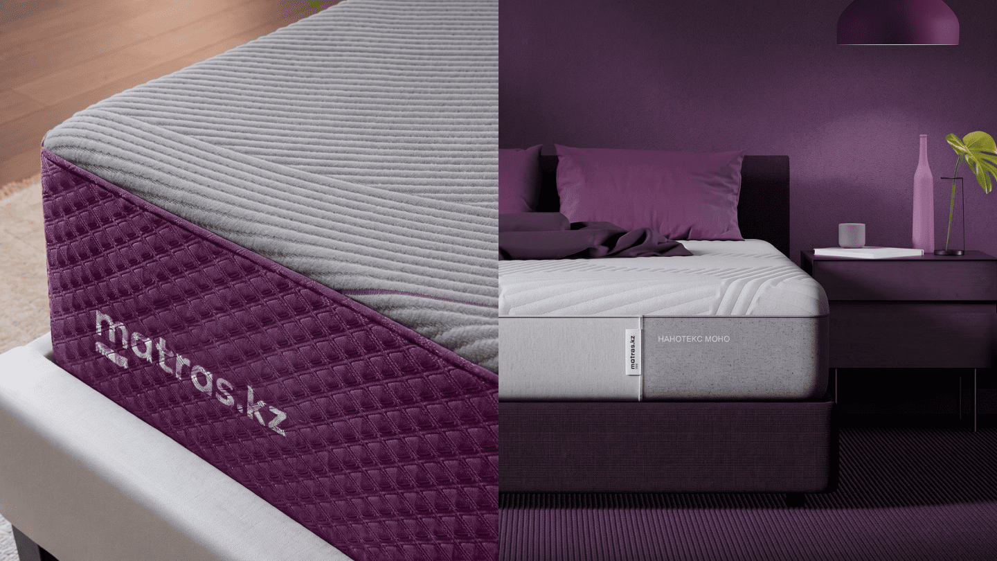
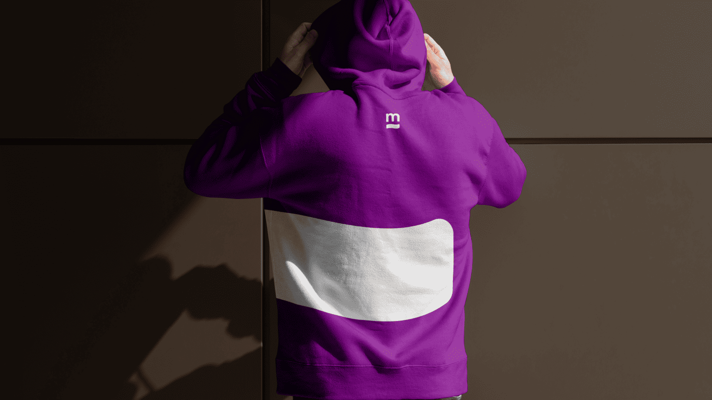
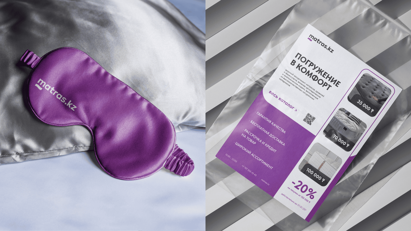
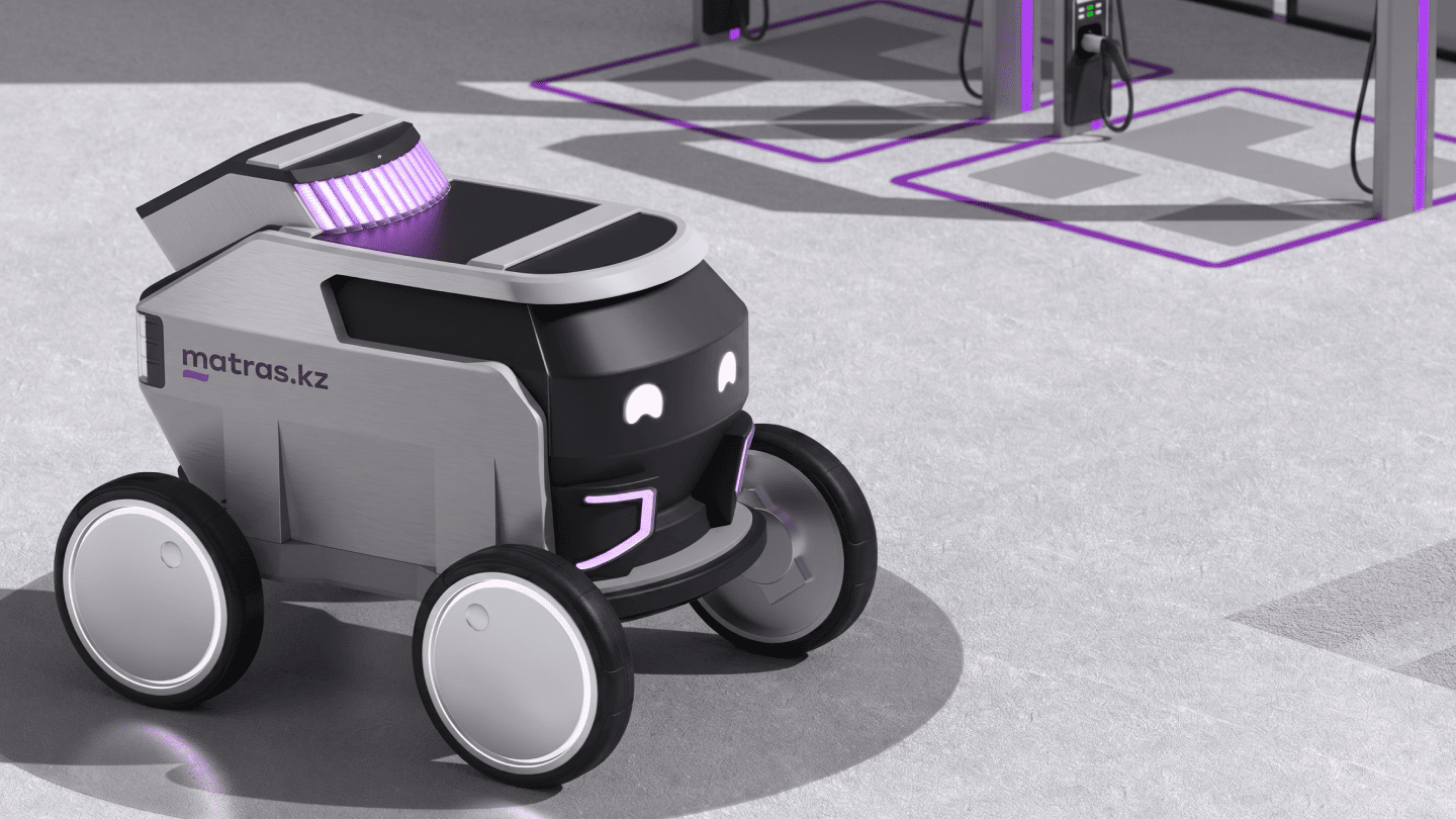
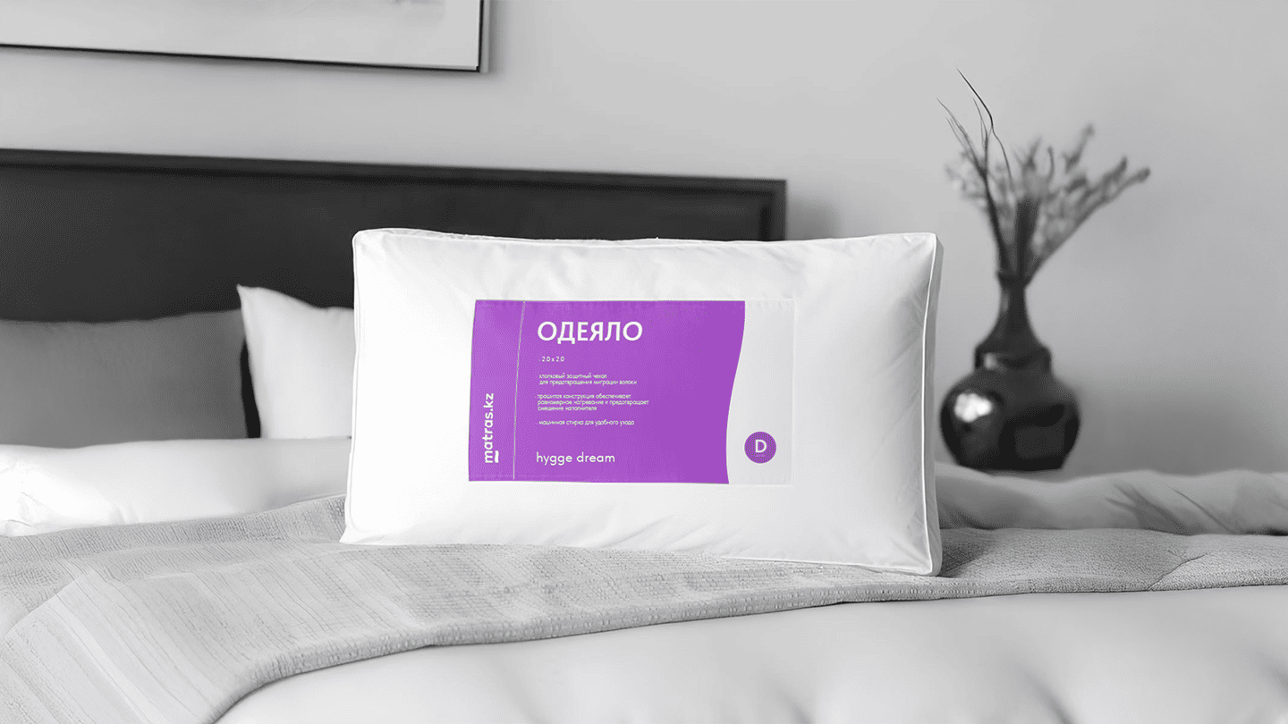
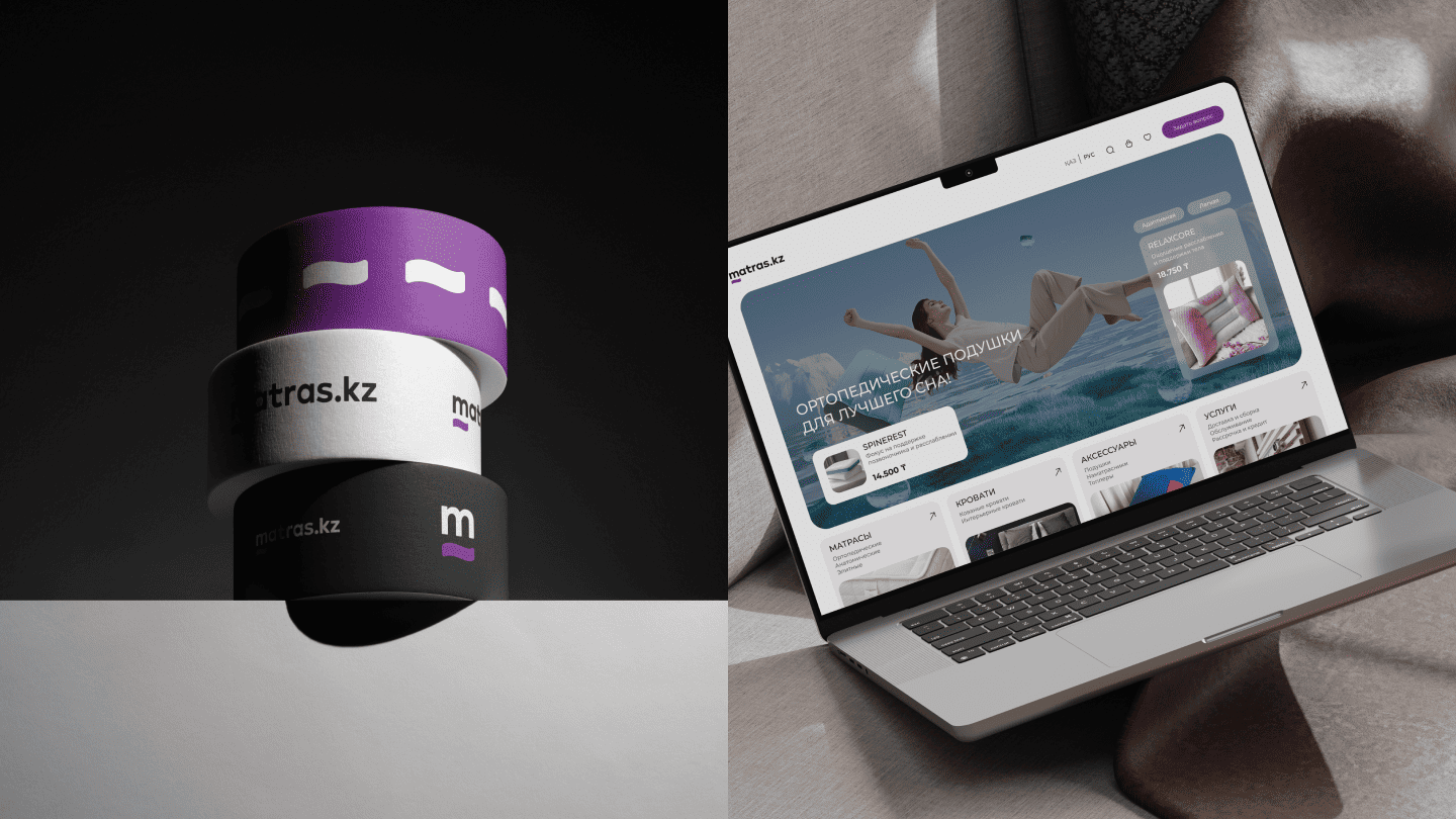
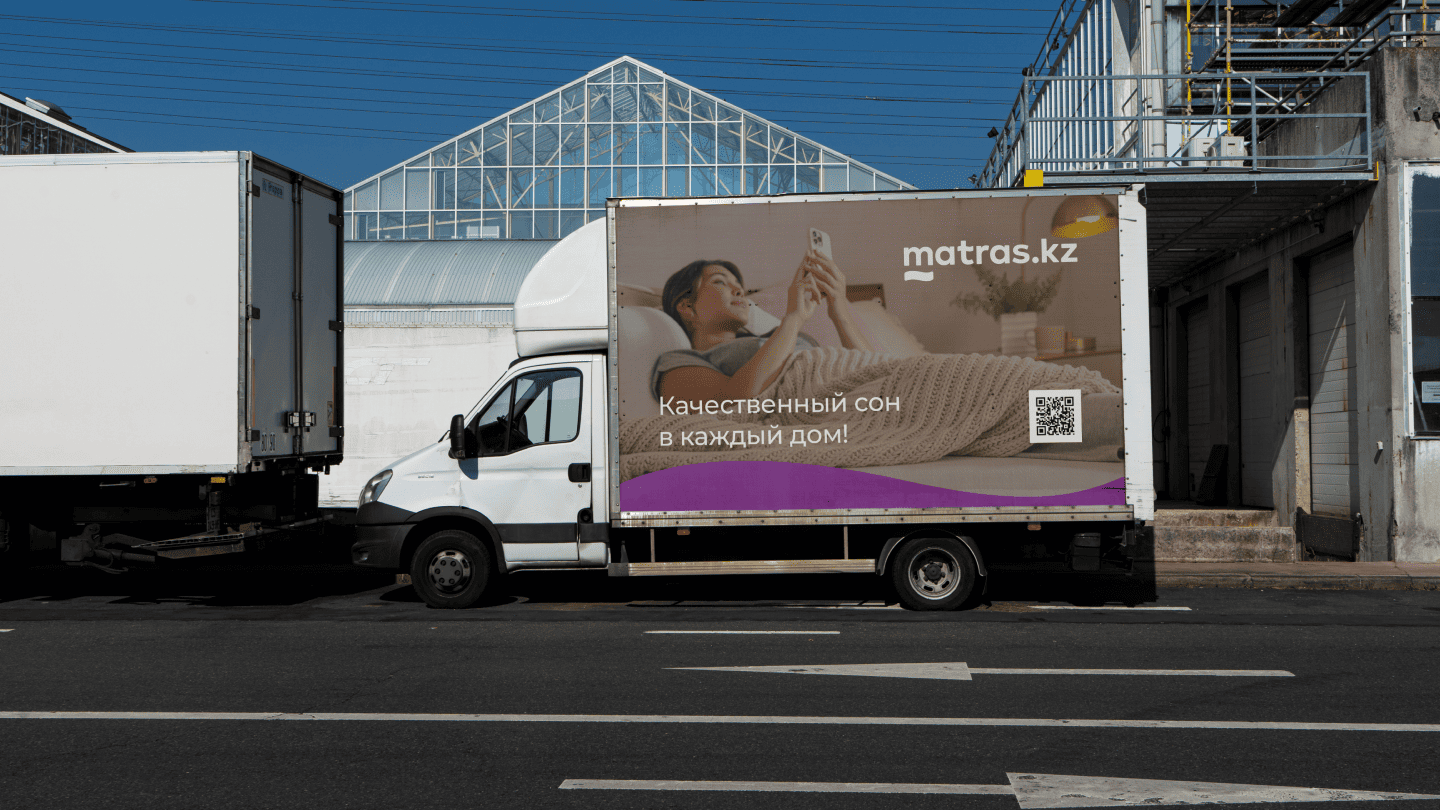
Logo and brandbook development reflecting the ideas of coziness and high sleep quality
The matras.kz logo is based on a typographic solution where every detail carries meaning: the underline of the first letter symbolizes a solid foundation of quality, while the fluid waves in the letter “t” represent the softness and flexibility of the products. We developed a versatile visual system that combines modern aesthetics with functionality, creating an image of a reliable and friendly service.
This personal data processing agreement is developed in accordance with the legislation of the Republic of Kazakhstan.
All persons who have submitted information constituting personal data on this website, as well as those who have provided other information by the indicated actions, confirm their consent to the processing of personal data and its transfer to the personal data processing operator.
Personal data of the Citizen means the following information: general information (name, phone number and email address); website visitors submit their personal data in order to receive detailed information about the services.
By accepting this Agreement, the Citizen expresses their interest and full consent that the processing of their personal data may include the following actions: collection, systematization, accumulation, storage, clarification (update, change), use, destruction.
The Citizen warrants that: the information provided is complete, accurate and reliable; providing this information does not violate the current legislation of the Republic of Kazakhstan or the legal rights and interests of third parties; all the information provided was filled in by the Citizen in respect of themselves personally.